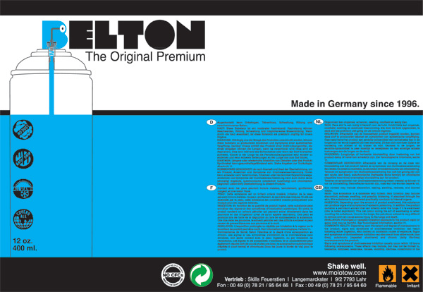
The second part of this brief was to re-brand an existing product either as a refresh of the design, a brand extension or to try and reach a different target market. For this I began with a spraypaint product analyzing the existing product and then looking at the products competitors and the target market. I then developed a concept focusing on the brands strengths of being one of the best artists spraypaints on the market and tried to focus on this as well as the more technical side of how the product itself dispensed the paint, developing this into a visual by combining a vector of the spraycan internal with the brand name. Also I wanted to promote the colour of paint contained in each can as this was not clearly marked on the original and I felt was an integral aspect of the product as well as being important to promote shelf presence. This rebrand was developed the same way as the first part of the brief however was undertaken as an individual and was finalized to a level where the concept could be presented at the end of the week.
The final part of this brief was a two week brief to re-brand three existing baby products for the company Nuby, focusing on the constraints of a brief given to a local creative agency Different based in Newcastle.
The main aspects of the brief were to produce packaging which was modern/fresh/simple and natural and which held continuity throughout the range. The route I chose to take for this was to design the packaging with a more high-end modern feel, with the packaging remaining information free on the exterior with all of the important information contained within and on the base of the box. Once the concepts were realized I presented them in a crit held by one of the directors of Different. Overall feedback went well however i missed the point slightly with colour and should maybe have considered a stronger colour palette to give the concepts more shelf presence, but I will develop this further to hopefully tie in better with the brand.


0 comments:
Post a Comment